Internal Revenue Service's Website Relaunch
Overview
The IRS planned a migration from an OpenText CMS to Drupal. The change in platform allowed us the opportunity to re-evaluate the navigation, design and search functionality to address some of the many pain points taxpayers encountered.
Approach
To understand the various pain points users encountered, we performed a heuristic review of the site. In addition we spent a year collecting and analyzing research from a variety of sources including Google Analytics, 18F standards, ForeSee, internal call center data, etc. Below is a collection of some of the top research sources we used:
From this, we found a general list of pain points:
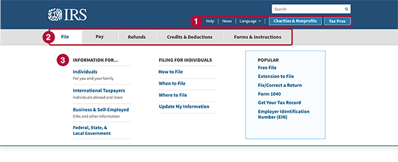
- Consistency in navigation: There are two competing navigation systems – the tabular navigation and drop - down audience based navigation. This is very confusing for the end user. The secondary navigation is non - existent since it changes from page to page. T here is also inconsistency in the labels used throughout the site and often within the page .
- Placemaking: Many pages do not provide user with a way - finding mechanism to know where they are on the site. The site appears largely product - driven instead of task/process driven.
- Reduction: Too many choices are presented in the global navigation. “Two critical lost opportunities are not using “megamenus” in the tabs and not providing clearer access to content organized for specific audiences”
- High abandonment rate on IRS.gov top level pages
- High volume of users toggling between landing pages and the homepage, demonstrating users lack of confidence in the current information architecture
- Low engagement (click-thru rate) on pages for mobile and tablet users
- High volume of searches related to content not available on the top level menu structure, revealing the incongruity between the current information architecture and the top tasks users visit the site to accomplish


By focusing on what users needed from the site, we distilled a top task list. The top task list is a group of ten tasks users most often come to the site accomplish. We used a combination of page views, entrances, downloads and inbound searches to inform our list. The top task methodology would become the overarching methodology guiding our recommendations for the information architecture and design.
Recommendations
Based on this data and top task list, we recommended the following changes and enhancements to IRS.gov:
Assumptions
- Megamenus will increase directness to popular content
- Highlighting top task content in navigation & design will reduce the amount of time/effort for users
- Homepage redesign will increase engagement and reduce abandonment rates
- While information architecture changes will decrease searches for top content, facets will allow users to drill down to specific content more effectively
2017 Enhancements
- Implemented a responsive design and re-formated the top 10% of pages (based on visits/downloads) for mobile optimization
- Emphasized top tasks in information architecture
- Refreshed design to optimize mobile experience and highlight changes to the information architecture
- Added mega menus to offer more navigation options grouped by category & audience type
- Faceted search to allow users to filter based on type of information & audience type
For an in-depth look at the changes we made to the backend information architecture, read the IRS.GOV Faceted Search project.
User Testing
- Qualititative Mobile Menus Test - The objective of the test was to ensure the usability of the menus across devices. Findings - Respondents liked the redundancy of the buttons on the homepage in conjunction with the top navigation drop-down menus. Some failures indicate certain labels did not perform well.
- Primary Navigation Treejack Tests - The first test was conducted with a draft version of the menu which is a combination of task-based and audience-based. The second test user a strictly task-based menu while the last was an audience-based menu. Key result - For most tasks, the Blended menu option scored higher than either the task-based or audience-based menus.
Results

Outcomes
The new IRS.GOV was launched in August 2017. Metrics showed:
- Directness - Users able to get to top task content in one click rose more than 88%. This indicates that the addition of the mega menus and design cues to promote the top tasks is catching users attention and getting them to where they need to go faster.
- Searches for top tasks dramatically, also indicating that users are able to find what they need in the information architecture more easily..
- Total unique searches on IRS.gov dropped more than 6%. Usually when a site is redesigned, site search tends to spike as frequent users get used to the new layout and feel. In our case, the information architecture and new design is making it easier for users to navigate instead of defaulting to search.
- On the redesigned homepage, users are spending less time on the page and exiting the site less frequently. This indicates that people are taking less time to process the page, and then performing an action that takes them deeper into the site. Additionally, the new homepage is loading faster for users, particularly those on mobile devices.
Furthermore, we had some surprising impact internally to the IRS and how we create and promote content on IRS.gov. Increasing the findability of information through improving the information architecture allowed the content owners to release their insistence on home page real estate.